


Prove Me Wrong — Overbuilt Products Never Win
Some products thrive, others get lost in feature creep. What's the difference?

I’m a product designer.
Over the years, I’ve built some opinions and gained some experience. These opinions change based on the logic life/work presents me.
But one thought has never wavered—overbuilt products never win.
Or, put another way—simple products win, even in crowded markets.
Most product designers are executors. That means, they don’t own any product decisions. They own the implementation of the product vision using their skills.
If you are a designer reading this, the one big thing you can completely own is simplicity. I’d even to the extent of telling you to fight for simplicity.

Some famous examples
Look at the products that lost their way.
Myspace. Too many features, no clear focus. Facebook kept it simple—feed, friends, photos. Myspace drowned in custom layouts, autoplay music, flashy backgrounds, and clutter.

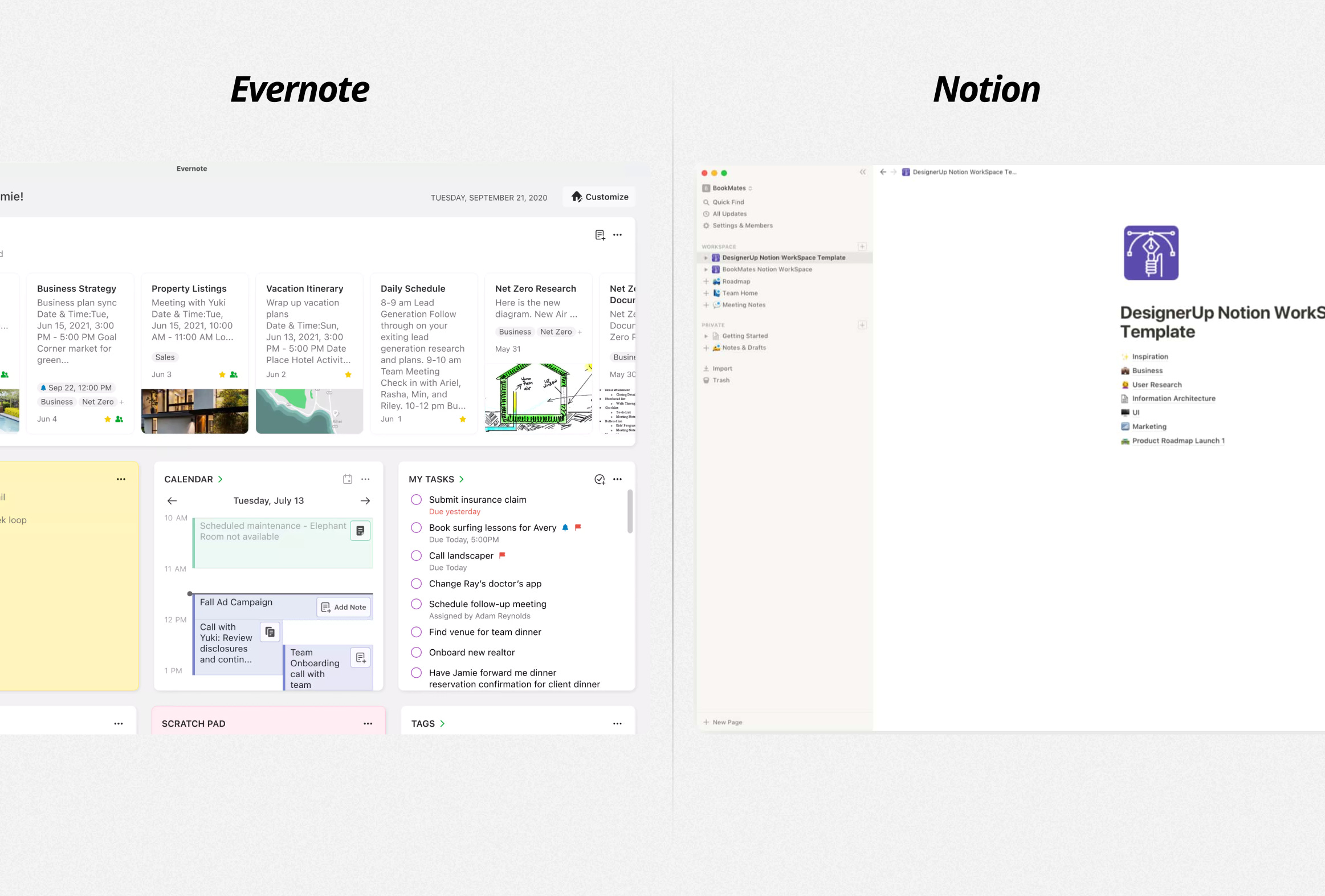
Evernote. The ultimate note-taking tool—tags, notebooks, AI, workflows, and a UI that got more and more cluttered every year. I loved Evernote at one point. Then Notion arrived with a simpler, cleaner, more flexible product. Almost everyone switched.
Skype. Once the go-to app for video calls. (Now this is slowly making me feel old…) Then Microsoft stuffed it with everything—chat, bots, integrations, ads. Zoom came along with one goal: effortless video calls.
Now look at the products that won.
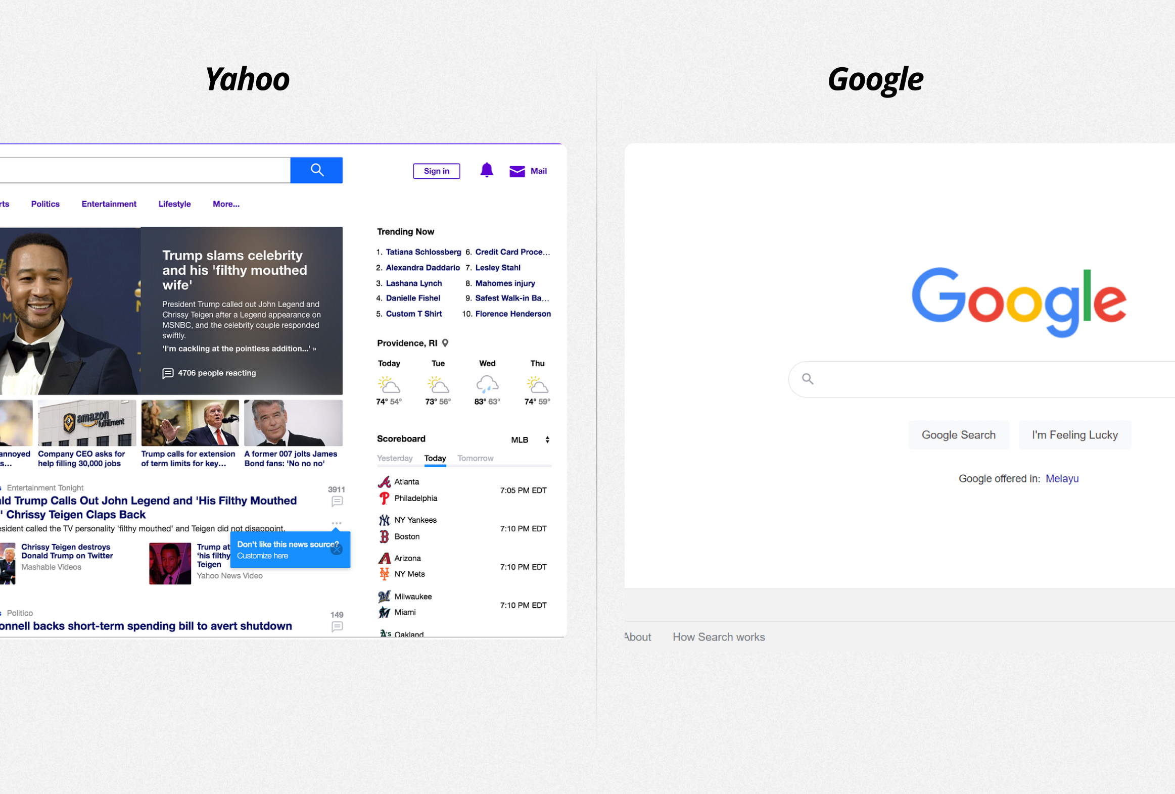
Google Search. Other search engines crammed their homepages with news, stock tickers, and weather widgets. I mean, who even uses Bing or Yahoo? Google stayed simple—just a search bar. It became the default.
Superhuman. Not the first email app, not the one with most features. Just the one that made email feel fast.
Apple Notes. No fancy formatting, no endless customization. Just a blank page that syncs perfectly.
Simple products aren’t basic. They’re just easier to pick up, easier to use, easier to stick with.
From my experience
I have been designing a single product end-to-end for the past 2 years. I’ve tried to keep it as simple as possible. Almost every customer says the product is easier to adopt, and easier to learn how to use.
A simple product doesn’t mean simple technology. In fact, the simplest experiences are often powered by the most complex systems.
Google search looks like just a text box—but behind it is one of the most advanced AI-driven ranking systems ever built, parsing billions of web pages in milliseconds. The iPhone feels intuitive—but that simplicity is the result of relentless iteration, complex hardware-software integration, and years of optimizing tiny interactions.
Simplicity isn’t about stripping things down to the bare minimum.
It is about abstracting complexity so users don’t have to think about it. The best products don’t overwhelm you with options—they make the right decisions for you, in the background, without making you feel it.
How to make your products simpler
Elegance isn’t just about UI, it’s a full-stack decision spanning product, design, and engineering. Here are a few suggestions from various sources.
➔ Abstract complexity, enhance clarity. The most powerful systems work in the background—users should experience the benefits, not the mechanics
➔ Prioritize speed and responsiveness. A slow, clunky product isn’t simple, no matter how clean the UI is. Optimize performance from day one
➔ Reduce settings, increase intelligence. Smart defaults and automation remove friction—users shouldn’t have to tweak everything themselves
➔ Clarity beats decoration. Aesthetic isn’t the goal—interfaces should direct focus and make decisions obvious
➔ Fewer decisions, better outcomes. Too many choices create fatigue. Guide users toward the best action instead of making them think through every step
➔ Make onboarding invisible. Users should feel comfortable from the first interaction—progressive learning is better than overwhelming tutorials
➔ More features ≠ more value. Every feature must serve a core need—bloat makes products harder to use, not more useful
➔ Build for the 80%, refine for the rest. Solve for the majority first instead of stuffing in edge-case solutions too early
➔ Make simplicity a company-wide discipline. The easiest way to ship a complex product? Let simplicity slip at every stage. It has to be intentional
In no way am I an expert in making complex products seem simple. I’d love to hear your take on it as well. If you disagree with what I said, I’d like to hear that too.
Until the next week,
Happy building!
If you liked what you read, consider sharing it with your friends. It helps new readers find good content. It might also give you an idea or opinion for discussion with them.
I’d love to connect with you 😃
I share ideas and thoughts on Twitter, LinkedIn and Substack Notes. I’d love to connect with you and talk about product, design or whatever interesting thoughts you have. Drop me a hi!